Enhanced User Experience for a Complex Membership Site
&w=64&q=75)

The Musicians' Union needed help understanding the complex needs of their users. After in-depth user research and analysis, we refocused their Kentico website architecture to meet their very diverse user requirements.

Who are The Musicians' Union?
Musicians' Union is the UK trade union for all musicians representing around 32,000 members working right across the music industry.
What they needed
Before we could deliver their new website, The Musicians' Union were keen to identify how to offer an improved user experience, with the specific objective to increase their active user base.
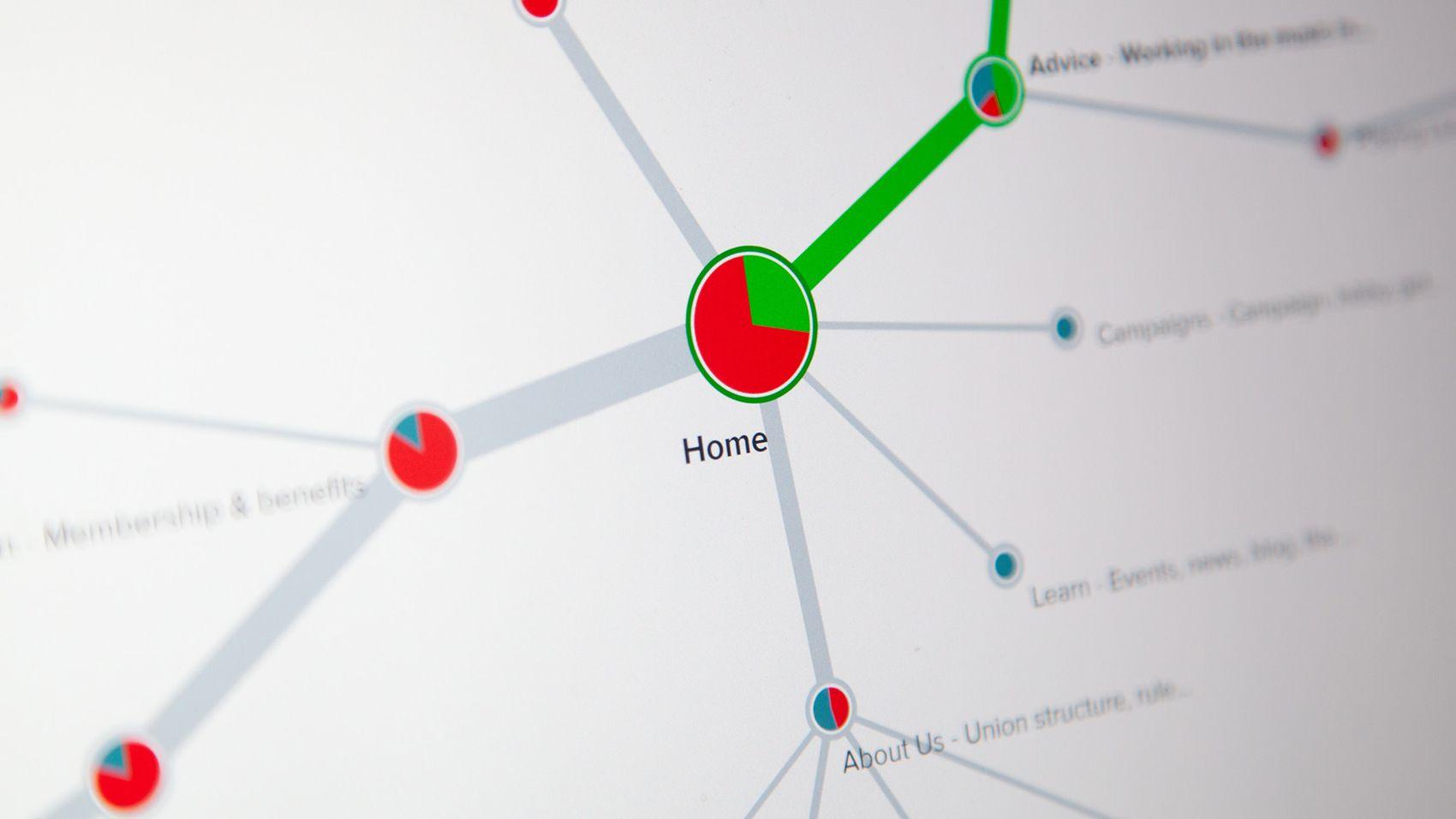
The navigable structure of content was the biggest sticking point of their existing site. There were over 2800 pages of value. The majority of this content was important for different types of users on the site - drummers, singers, producers, teachers, etc. However, the current user experience meant having to dig deep to find relevant content they needed. This process needed improving.
&w=64&q=75)

&w=64&q=75)

Our Solution
This project depended on understanding both The Musicians' Union's business and their users. After scoping out what our client required, the next step was extensive user research. Information architecture was the primary focus: we needed to learn and understand the current user journey to see how it could be improved. This research involved:
Interviewing ex-members, both in person and over skype.
Sending surveys to The Musicians' Union's existing client base.
Conducting tree tests - we gave users navigation scenarios to see how easy it was to locate information through different navigation hierarchies.
Undertaking card sorting tests. We wanted to see how users grouped together different types of content. We were able to determine this using specialist software and iterating on tests.
Completing our own analysis of the current website. We looked at how users were navigating it, when they were hitting dead ends, when they were exiting and what they were looking for.
Analysing data so we could understand the quantifiable metrics of the project.
&w=64&q=75)
What We Delivered
A comprehensive requirements analysis that detailed all the understandings, objectives, pain points, SEO observations and recommendations.
A new, well tested Information Architecture that allows users to find the exact content they are looking for.
The results:
55%
IA improvement - an increase from 41% to 75% in tree test completion.
35%
Drop in search exits.
22%
Decrease in top 5 search requirements without page view drops.
Here's what they had to say:
‘Thanks to the flexibility in approach to the working process, we managed to adapt and manage changes in the fast-changing times as the website was in testing and development stages during the pandemic. This helped us greatly to deliver the final product with the right focus at a time of its launch.’
Katerina Baranova
Digital Development Officer, The Musicians Union